Identify responsive issues across viewports instantly
Assess your site’s responsiveness across mobile browsers, standard resolutions, and custom screen sizes to ensure a seamless experience for every user on every device.
AI-powered responsive checks with Percy Visual Engine
Focus on the responsive errors that impact users most. Automatically filter out layout noise, anti-aliasing shifts, and minor text movements to review only what matters.

Validate responsive errors on real mobile browsers
Catch layout and rendering issues across real mobile browsers to ensure your site looks and functions correctly across popular mobile devices.

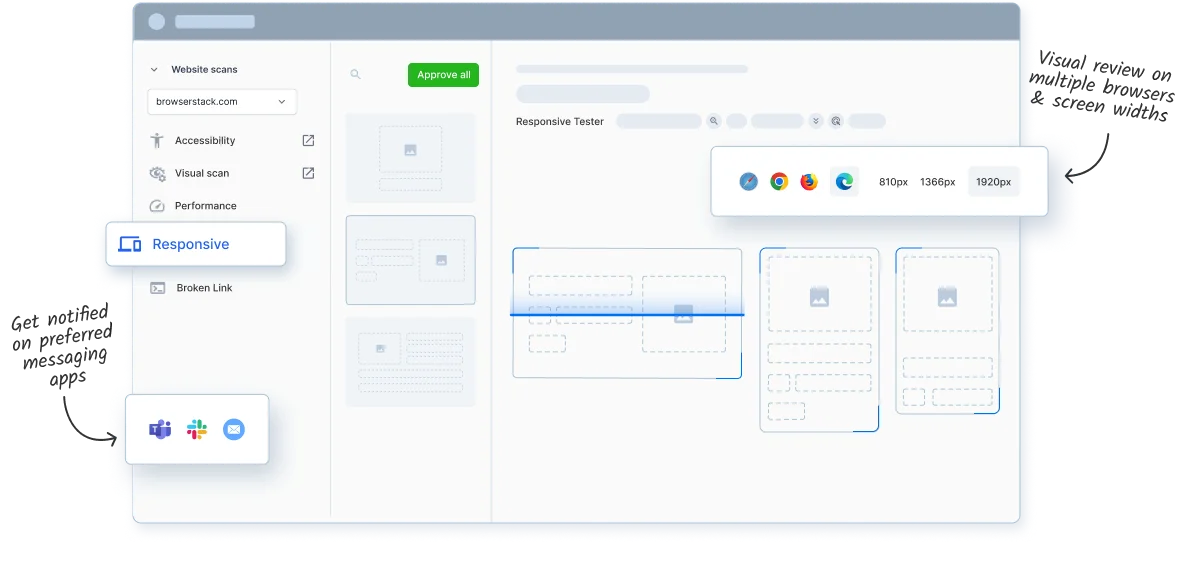
Test responsiveness across common and custom viewports
Run scans on common desktop resolutions to ensure your site behaves correctly across screen sizes. Add custom sizes to cover non-standard displays for complete responsive coverage.

Run responsive scans with configurable parameters
Customize responsive scans by hiding dynamic content and adjusting comparison sensitivity. Focus only on meaningful UI changes that align with your project needs.

Skip manual URL entry—scan with a sitemap
Quickly launch responsive checks using your sitemap. Scan entire sites or specific sections—no manual URL input needed.

Scheduled scans for ongoing responsiveness checks
Run automated responsive scans on a daily, weekly, or monthly schedule to identify errors early and view trends over time.

Check responsiveness on gated pages
Website Scanner can crawl authenticated pages—via login or cookies—to detect responsive issues across all user touchpoints on your website

Scan internal pages in staging environments
Identify responsive problems before release to avoid layout bugs reaching production and ensure your site performs well on every screen size.

Get prompt alerts when scans complete
Get notified on Slack, Teams, or your inbox as soon as scans finish, enabling fast review and quicker issue resolution.

Achieve visual perfection effortlessly with Visual Scanner
Run your first scan now!
